
Occupying a prominent position on Russell Square, Kimpton Fitzroy London was designed in the late 19th century by architect Charles Fitzroy Doll in a flamboyant French Renaissance style. The surrounding neighbourhood later became home to the Bloomsbury Group, an influential circle of writers, artists and thinkers whose work embraced expressive colour, pattern and interiors and left a lasting legacy.
The historic building makes an impression before guests even step inside, with its red brick and terracotta façade defined by arches, balconies and turrets. Meanwhile, the richly detailed interiors bring together coloured marble, decorative plasterwork, stained glass and a grand staircase. More than a century after the hotel first opened, these original materials and architectural features present indelible charisma.
This did, however, create a complex setting for the redesign of the hotel’s ground floor. Drawing on its experience across interiors, furniture and lighting design, Gunning Bespoke considered the project at every scale, from the overall flow of the spaces to the individual pieces within them. The studio worked with the architecture rather than competing with it, introducing smaller, more intimate spaces within the grandeur of the existing building.
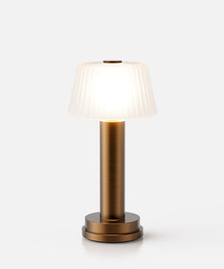
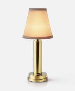
Lighting was another important part of this approach. NEOZ Victoria cordless table lamps introduce a more intimate layer of light across the ground floor, illuminating individual tables and seating areas without the need for additional wiring within the listed building. Aged Brass was selected for the Lobby and Fitz’s Parlour, complementing the distressed and antique brass finishes throughout the scheme, while Satin Nickel connects with the existing metalwork in Fitz’s Brasserie.
NEOZ spoke with Gunning Bespoke’s Emily Gunning about designing within a building of such strong character, creating spaces that work throughout the day and choosing materials that will continue to develop with age.

Victoria in Aged Brass by a window at Fitz’s Parlour, where daylight gives way to a warmer pool of light at table level as the afternoon goes on.
What was the starting point for reimagining the hotel’s ground floor, and how did you want people to use the space?
The hotel had quite a lot of dead space which needed to be brought back to life. It’s such a vast building, so a big part of the challenge was creating smaller, cosier nooks within that grandeur – places where people would actually want to sit and spend time.
That was really where the project started, along with the redesign of the terrace. Success was about making much more of the ground floor usable.
H With a building this architecturally assertive, how did you decide where the new design should defer to what was already there and where it needed a stronger voice of its own?
I think with a building like this, you shouldn’t fight what is already there in terms of the architecture and architectural finishes unless really necessary.
There is a huge variety of stones and marbles throughout the ground floor, so it was important that anything new complemented them rather than competing with them. The existing architecture gives you a really strong backdrop, and then the furniture, fabrics, lighting and details can bring another layer of warmth, colour and personality.
How does Bloomsbury’s creative history influence the way you approach colour, texture and pattern?
It encourages you to be a bit more daring with colour, texture and pattern and to move away from everything feeling too coordinated. Sometimes things that clash slightly can actually be much more interesting together! It doesn’t all need to be too matchy-matchy.
We used lots of beautiful fabrics in strong colours and patterns, which really pop against the grandeur of the architecture, and mixed them with richer timbers, brass and stone.
There was also a freedom in the way we combined things. The spaces still needed to feel considered, but not overly formal. The hotel should feel special for guests, while still having some of the comfort and familiarity of a home away from home.
 A banquette beneath the carved marble staircase in the hotel's lobby, one of the nooks Gunning Bespoke shaped into more intimate seating.
Were there moments when the room dictated the piece, and others when a particular piece began to shape the room around it?
Absolutely. Some of the spaces are quite tricky, particularly the nooks either side of the staircase in the very grand lobby area. Turning those into cosy, more private spaces was really only achievable by designing something specifically for them.
That’s often where bespoke furniture becomes so useful – you’re not trying to force a standard piece into an awkward space. You can work with the exact proportions of the architecture and think about how somebody is actually going to sit there, where the tables need to be, and how enclosed or open you want it to feel.
There were quite a few pieces across the project where the room really dictated the design in that way, and then once that main piece was resolved, the fabrics, lighting and smaller furniture could build around it.
As a hotel that works from breakfast through to late drinks, did you deliberately choose materials like mohair, timber and distressed brass, which acquire character with age?
I’ve always loved things that age beautifully, whether that’s a leather jacket or an old armchair. I completed a Master’s in Sustainable Design, and this subject was a huge part of that. With a building like this, which already has so much age and character, it felt important to introduce materials that could live with it and develop over time rather than needing to remain completely pristine.
Timber, brass and good natural upholstery fabrics can all become richer with use if they are the right quality to begin with. For me, that’s the difference – something well made in a good material can soften and develop a patina, whereas something poorly made can very quickly just look tired.
The hotel itself is old and still looks fabulous, so the new pieces should be able to age beautifully alongside it!
With the spaces used differently throughout the day, how did you adapt the furniture, spacing and lighting to support such different behaviours?
Seat heights and depths, as well as table heights, are incredibly important. You have to make sure people can genuinely use the furniture in different ways rather than it just looking right.
In the Parlour, we included lots of lovely stools with the idea that they can be taken away when more space is needed – for example at breakfast – and then brought back in later in the day to create that cosy, layered feel you get in some of the best cocktail bars.
The lighting also changes how the space works throughout the day. The NEOZ lamps really help with this, bringing the spaces to life in the late afternoon and evening as the natural light disappears. They allow you to create a much more intimate atmosphere at night without having to completely change the furniture or the way the space is arranged.
 In Fitz’s Parlour, movable stools and a Victoria on every table let the room shift from breakfast service to evening drinks.
There is already a great deal of architectural and decorative light in these rooms. What did cordless table lamps allow you to do that the existing lighting and sockets could not?
Being a listed building, it isn’t always easy to introduce additional sockets exactly where you want them. Cables can also be cumbersome and get in the way, particularly in spaces where furniture may move or where guests are constantly circulating. It was important that every table and seating area felt equally considered – that wherever you chose to sit, it felt properly lit and special.
Adding small table lamps gave us another layer of light that was both decorative and functional. It creates a much more intimate pool of light at table level, which the architectural lighting alone can’t really do.
When you specify another maker’s product rather than drawing something bespoke, what do you look for?
I usually ask for material samples, or sometimes a whole piece if possible, so that I can see it properly, measure it, feel the weight of it and check the quality myself before specifying it.
It can actually be quite difficult to find the right off-the-shelf item. If it’s going to sit alongside bespoke pieces, the quality has to hold its own. You don’t want one item letting down the rest of the space just because the proportions, finish or material quality aren’t quite right.
How did you first come across NEOZ and the Victoria lamp? What criteria did your choice need to satisfy?
I’ve been working in the industry since 2012 and have worked with some fantastic companies, including MBDS, headed by Martin Brudnizki, where I was for quite a few years. We often specified NEOZ lighting for projects there, so I already knew the quality and how well the pieces perform in hospitality environments.
They have a really lovely weight and solidity to them too, which makes them feel like a proper piece of lighting rather than something lightweight and temporary. Some of those projects are years old now, and the lamps still sit beautifully within them.
For this project, I needed cordless lighting that felt completely at home with the rest of the scheme. I didn’t want something that looked like a portable lamp had simply been added afterwards. It also needed to be robust, easy for the hotel to use operationally and give a really good quality of light.

Victoria repeated from table to table, giving the ground floor a quiet continuity across rooms of different character.
The Victoria lamp appears across the Lobby, Fitz’s Parlour and Fitz’s Brasserie, despite the different characters of those spaces. What made Victoria right for these rooms?
Using the Victoria across the Lobby, Parlour and Brasserie helped create a subtle thread between the different spaces, but we changed the finish depending on the setting.
We used Aged Brass in the Lobby and Parlour, where it sits naturally alongside the distressed and antique brass finishes used throughout those spaces. In the Brasserie, we chose Satin Nickel instead, to work with the existing architecture and metalwork in the restaurant.
The Parlour and Brasserie were always intended to feel connected, although we were able to be a little more playful and decadent with the finishes in the Parlour, using more marble, mirror, pattern and texture. There are little nods to that in the Brasserie, particularly in the large drinks cabinet and in some of the cushion and banquette details, but on a much more discreet scale.
The Victoria worked well across all three areas because it has enough character to hold its own, but it isn’t overly decorative. Using it in different finishes meant we could have that continuity without making every space feel the same.
Of all the decisions on the ground floor, what is the detail you suspect most guests will not notice on their first visit, but might discover on their third?
Good question! Probably the amount of thought that has gone into the smaller transitions and details between spaces. There are repeated materials, colours and furniture details that quietly link one area to another, even though the rooms each have their own character.
I like details that you don’t necessarily notice immediately. You might just feel that everything belongs together on the first visit, and then on the second or third start noticing a particular fabric appearing somewhere else, a brass detail repeated on another piece, or the way a colour from one room has been picked up again in the next.
When in London.
The Kimpton Fitzroy London is at 1–8 Russell Square, Bloomsbury, directly overlooking the historic Russell Square Gardens. Fitz’s Parlour is open daily from 8 am to 10 pm, and Fitz’s Brasserie welcomes guests from 12 pm to 9:30 pm.